Robert Nakano

Robert Nakano

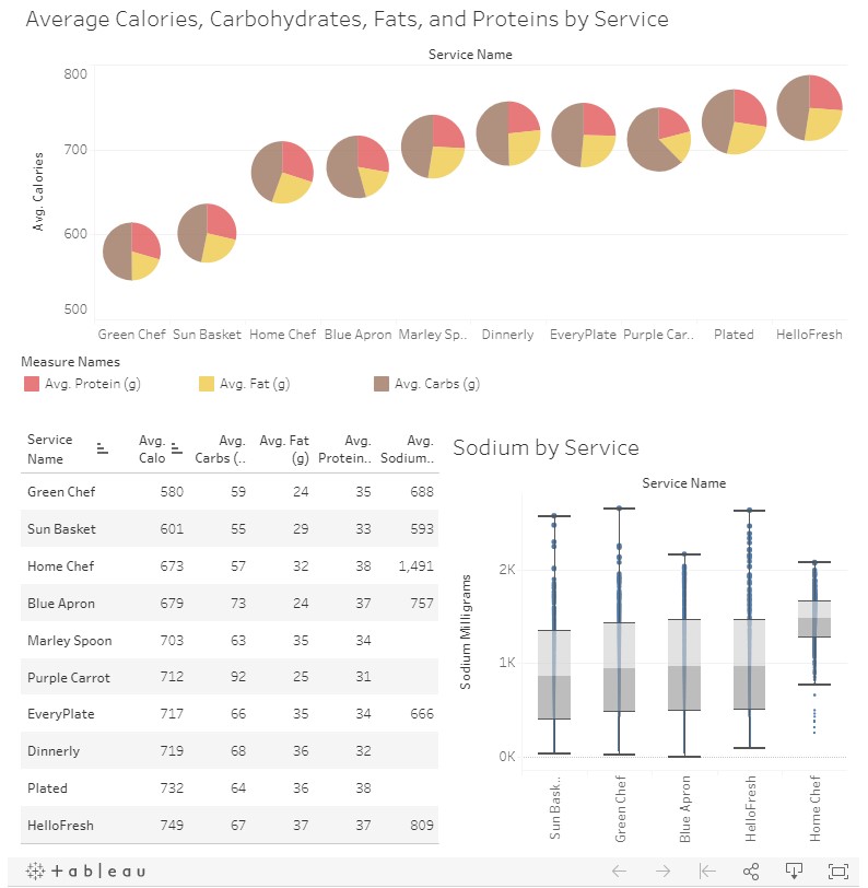
Visualization and Analysis for Meal Kit Nutrition Information

Methods: Data Analysis, Data Visualization, Tableau

Summary

This project was a blog post on Pick a Kit, Are meal kits healthy?, aimed at helping to answer the question "How healthy are meal kits?"

My colleague, Aaron, and I worked together to collect and analyze data from various meal kit services. Our dataset included a total of 10 meal kit services and 9,750 unique meals.

My assignment here was to find a compelling way to visualize the differences in nutrition information for various meal kit services. After a few iterations, I came up with an interactive Tableau chart, which we ended up using on the final blog post. Our user feedback suggests this page has been the most helpful for Pick a Kit users.